Authorship Content
Final Major Project
Initial idea - experimental zine/comic that explores the idea of obsession/an obsessive personality through a character and their sudden obsession with the sheep. They'll live in solitude before this after leaving a noisy social life and enjoy the peace of being alone. It will involve some world building and hopefully create a story that isn't limited to just this comic.

I begin by drawing and making to get a sense of my idea and start to visual the characters and their life.


playing with colour and different mediums


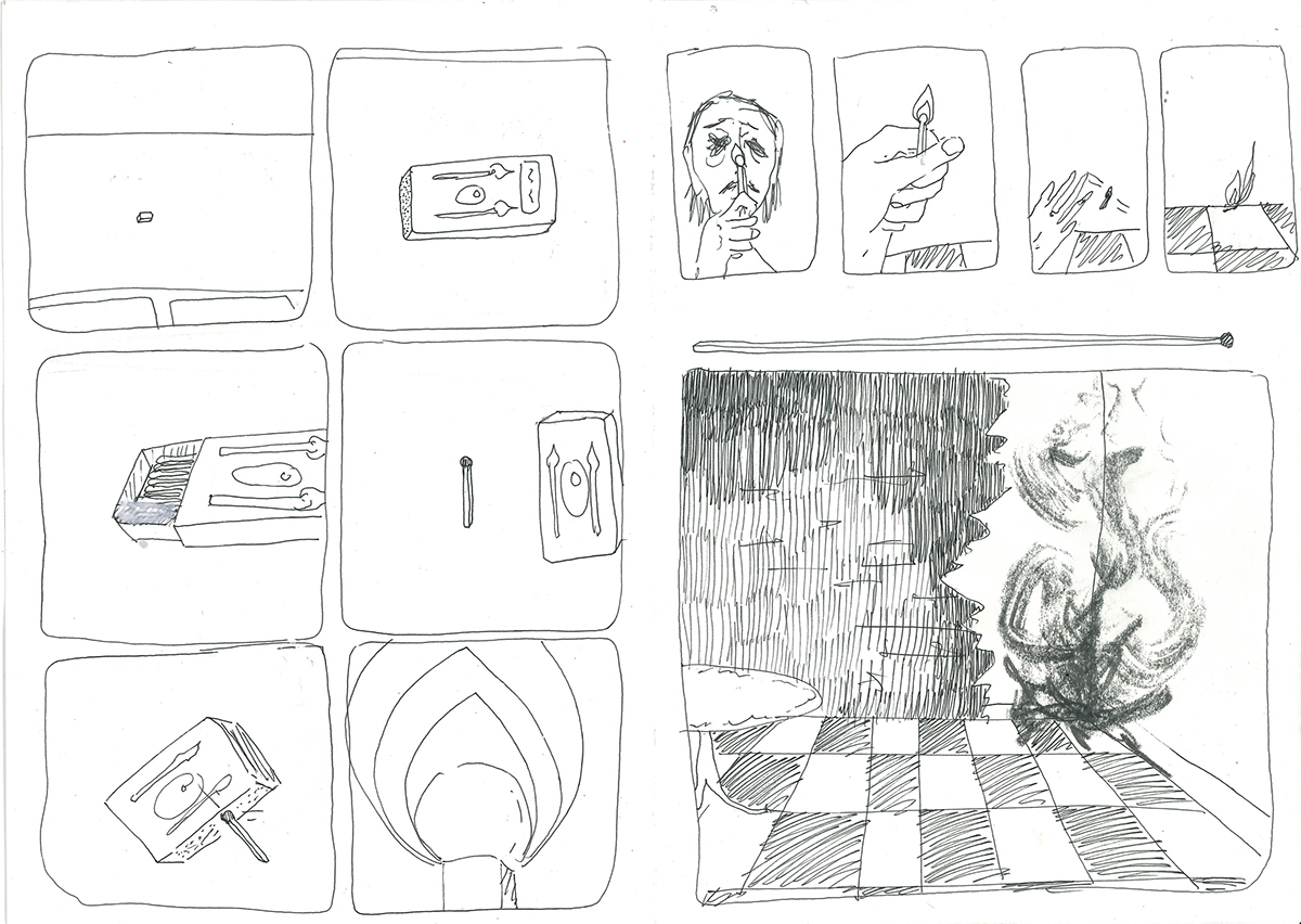
Trying comic panelling and how this project may look moving forward.
Artist Research
Oz Magazine


An anticulture psychedelic magazine from the 60s - abstract illustration and comic shorts. The use of consistent colour schemes and interesting drawing that goes outside of usual panelling is very interesting. Love the humour and weirdness of the drawings.
Sasaki Maki


Desert Eyeball 1970


http://www.ceiling-gallery.com/blog/2016/3/7/sasaki-maki
Ding Dong Circus 1967-74
These two comics show really wells Maki's consistent style and visual language that brings together collections of nonsensical drawings. I want to play with the idea of abstract narrative and story telling and how they can exist in their own artistic right. He was often criticised for these drawings and called a mad man for producing this type of comic with no storyline. Although my comic will have a basic idea and story to follow, I'm happy with the drawings having their own artistic authority outside of telling a story. His use of tone and pattern in these comics make the spaces he's drawing interesting and draw you right in. There's no need for words and when they do appear, they are part of the artwork as opposed to existed alongside it.
Further Drawing and experimentation


Narrative Research
This section will detail me research into the narrative content of the comic. I plan on working visually at the same time to produce a personal iconography which will hopefully help me choose a better route for the script. There are main routes here; to write a story myself, to base a script loosely off another story (adapt) or to use text from something in the public domain.
Hymns[edit]
While there are innumerable references to the Good Shepherd image in Christian hymns, specific references to this parable can be recognised by a mention of the ninety-nine other sheep.
A hymn describing this parable is "The Ninety and Nine" by Elizabeth Clephane (1868), which begins:
There were ninety and nine that safely lay
In the shelter of the fold.
But one was out on the hills away,
Far off from the gates of gold.
Away on the mountains wild and bare.
Away from the tender Shepherd's care.
Away from the tender Shepherd's care.[6]
In the shelter of the fold.
But one was out on the hills away,
Far off from the gates of gold.
Away on the mountains wild and bare.
Away from the tender Shepherd's care.
Away from the tender Shepherd's care.[6]
I am the vine; you are the branches. Whoever abides in me and I in him, he it is that bears much fruit, for apart from me you can do nothing.
Do not love the world or the things in the world. If anyone loves the world, the love of the Father is not in him. For all that is in the world—the desires of the flesh and the desires of the eyes and pride of life—is not from the Father but is from the world. And the world is passing away along with its desires, but whoever does the will of God abides forever.
Set your minds on things that are above, not on things that are on earth.
Edgar Allen Poe poems


Here I'm starting to think about how I would like to tell the story using 6/10 page mini booklets. I also ended up developing the character adding hair and more defined look.
The other character;
as discussed in a tutorial, I was directed to contextualise the characters to the story and narrative. Sheep are often seen as communal animals that stick with their herd which may not fit with the story very well.
Here I will research some other animal motifs that may make more sense to the story while still being one home to the English countryside.
The mouse;
White Mouse Symbolism
A white mouse symbolizes happiness in your love life, and are considered to be sign of finding true love or committing to someone forever. White mice are also seen as a good omen of a happy, long-lasting marriage.
Gray Mouse Symbolism
A gray mouse symbolizes problems you're facing in your life, and the need to find a solution to them. Gray mice can also represent fear.
Blue Mouse Symbolism
Though blue mice don't exist in real life, you might see one in your dream or as a symbol. A blue mouse is often associated with an open mind and encourages you to look at something from a different perspective.
Pink Mouse Symbolism
Also a specifically colored mouse that doesn't really exist, p pink mouse represents entering into a happy relationship where you are respected. It represents new and true love.
'In all, the mouse symbolizes lost opportunity and jealousy in Christianity.
Mice (also known as Mushika or Akhu) in Hinduism represent the ego, the mind, and the pride of the individual. Ganesha, who is one of the most worshiped deities in Hinduism, rides atop a mouse, which completes conquest over egoism.'
They that sanctify themselves, and purify themselves in the gardens behind one tree in the midst, eating swine's flesh, and the abomination, and the mouse, shall be consumed together, saith the LORD.
Source: https://bible.knowing-jesus.com/Isaiah/66/17


Process Research
Although I've already played around with process, I find it useful to think what aspects of the work I like from the artists I'm researching and how I may apply this to my own work. I'm a printer at heard and so want to play around with that but also leave my comfort zone working digitally. I feel the best way for me to do this is first make physical work and then exploit it fully digitally.
Print
Imiri Sakabashira's Letterpress Monsters


Takei Takeo (1894–1983), from his handmade artist's book Moridon no hanashi (The Tale of Moridon), 1951,


Drawing


Jan Konupek, from the cycle Dream Land, 1940, found in Edgar Allan Poe and Art in the Czech Land


Marina Shirakawa
Playing around with photoshop


This was achieved with halftone colour filters and bitmapping on photoshop, essentially the same process as creating positives for screenprinting.
Making stage - three weeks
I decided to put process aside for the meantime as my main focus and instead try and flesh out the story as much as I can. This will mean the story is visualised at the most basic level and I can spend more time after thinking about process and design.


I found this initially extremely difficult to do. Working in pen and not caring as much as I can about the quality of the drawings helped. But thinking about perspective and how I want the story to be told took a while to get to grips with.
HEADBLOCK - 27/2/23 tutorial
tutorial notes
- slides ok so far
- expand on moments of stillness - think about pace and frames
- Understanding comics - Scott Macloud
- David Hughes - Walking the Dog
- Bill Bragg for examples of narrative work (pace)
- Think about surrealism/ surrealist narrative
- Kafka and existentialism - punchline depressive ending
- Have Mondays as thinking day, Tuesday unit x, Wednesday work then Thursday and Friday workshop making.
- Laura Carlin - ceramics and wonky animals
Further artist research
David Hughes -


Interesting line quality and in and out use of colour. Helpful to study in terms of his pacing. I also want to learn how to use type in a similar way when making comics, as here its part of the artwork as opposed to being alongside it.
Surrealist drawing
Frida Kahlo


Laura Carlin - ceramics


Monoprinting
as discussed on Monday, I went on with process rather than continuing to try and finish all sketches for the whole storyline. I was resistant to using mono print again as it was such a big part of my last project, however Ben encouraged me to try it again replicating the drawings for panels I had done in my sketchbook. In my head the comic had a refined look and this process couldn't achieve that, however after processing them digitally I could see their potential and fall back in love with the process.


Attempting photoshop to use mono prints in comic page;

I separated the image from the background using select colour range. This however pasted a faint reproduction of the drawing so I pasted this. multiple times and flattened the layers. I don't think this was an efficient use of photoshop and maybe altered the quality of the image.

This is said image after editing.

Draft page for how prints could be used.


After I got comfortable with photoshop I realised the correct thing to do was to select shadows and play with fuzziness and contrast to achieve the line qaulity I was looking for. I could then edit image adjustments and play with the brightness and contrast to get a blacker line. The last image is me starting to put pages onto indesign to help me visualise the final product and how pages may look.
I started off with b4 however after later on looking into printing I realised A format pages will be a lot simpler to produce without losing any aesthetic sensibilities.
this weeks plan based on group crit
- think less about end product and be more experimental
- look at David Lynch. tracy emin and Henrik dresser for more experimental surrealist mark making
- moments of stillness -
David Lynch - multimedia


I massively admire Lynch's work and so recent comparisons to my work in group tutorials have not only made me happy but inspired me to look more at his work. I found his lithographic prints which have a more painterly look and emotive feel. I want to incorporate this look more into my work as I loved the original oil painting I did at the start of the project and haven't yet found a way to use in the comic. I also find his multimedia works interesting in expressing tone and his subject matter. This could be another option to photograph or scan in in an interesting way
Screenprinting
I spoke to the technicians in the print room about these ideas and they advised me for this type of work, lithography wouldn't be viable at this stage of the year. They suggested I instead try making positives for screenprinting by hand by painting or drawing directly onto acetate. Below are the results of this experiment.
I didn't end up taking this process much further. It was purposeful to learn as I like to expand my technical abilities in printing and learning all the ways to do something, however the line quality was too clean in comparison to the rest of the prints, and was more useful for making multiples rather than one offs.
Screenprints after reworked in photoshop


They also suggested I try mono printing in a different way; to paint ink on directly to tabletop/acetate sheets, then relief print using these. I found this much more effective in creating the kind of image I was looking for. I liked the more unpredictable nature of this method and the space for experimentation it created. I will definitely be continuing to experiment with this in the future and towards the end of the comic where I want it to get more experimental and sort of crazed.


Group crit
The crit was very useful for seeing what people responded to best. It seemed from feedback comments that the mono prints were most successful alongwith compositions in my sketchbook, so moving forward I may focus more on these elements using other mediums for pages with more drama where necessary. I was become a little disillusioned with the project anyway and losing confidence in the idea so this was very nice to see.
Surreal drawing games - for wall.


Ben recommended to try surrealist drawing games to help with the creative wall I was having. The majority of these drawings are wrong for this project however it helped to see what kind of thing I don't want to include. I was regretting not doing more fine line and ink work which was my original plan when I thought up this brief so it was good to put that thought to bed and see how my current direction is more effective.
Making a font
I want to maybe incorporate text in my project, but also for my reflective document so will be useful to have.


Homage to my oringinal research - risograph and thinking about colour
My original research and interest in this project began with 60s/70s psychedelic nonsensical comics and zines - both for their content and aesthetic value. I want to go back to this with the final process of print for publication. Risograph was at the time used as the low cost allowed for the underground comic scene to blossom and experimentation to take place.
I'm planning on printing off the mono prints with risograph and see how they come out and become more familiar with the process, then play around more with the mixed media pages and how I may be able to incorporate colour.


things to remember from this session;
-put each colour in a layer and group them.
-the printer has limited colours - take photo and consider the tones
-each master is £1
-save as photoshop file
Two weeks to go
-decide format in terms of size
-decide text
-finalise plan for all pages
-plan cover page
possible colour palettes.


Going back to basics with the sketching process. I ran out of momentum entirely over easter for the creative side of the project. I was tired of drawing and didn't like any of the pages I was sketching as seen below.


I therefore decided to go back to basics and draw up the scenes without thinking about layout. This was really helpful at the start of the project to visualise the story so I could then think about the visual language and layout after. I then gradually got more comfortable and the layout came naturally and so hopefully that will happen. Below you can see some remakes of these pages after doing this.


Making title / cover page.


insert sketches of cover pages - decide on simple design.
This was a really difficult process for me. I went back to my original research that was going to contextualise the mouse character and possible add text from scripture or poetry. I looked again into theHindu story of the Mooshak whereby the Hindu God Ganesh rode atop his Vahaan; the Mooshak (a giant mouse) who represents the ego. This made some ideas for the title and below is seen one of those ideas, however I want to discuss with ben what makes sense contextually to the story and make sureI'm being culturally sensitive if I do use a related title.
In terms of the cover page I decided simple was best possible using drawings I have already done. I am not confident in the slightest when it comes to graphic design and typography and so again this is something


back page would be black
INSIDE COVER PAGES


Submission
Below I'll show the finished plan of the comic for submission. I have completed majority of the pages ready to be risograph printed and bound. Those not yet mrnoprinted have been drafted to the point I know I can simply recreate them in print composition and design wise. I decided at leading up to the submission to focus on the design element of the project as opposed to the final technicalities that I'm confident in finishing. I've tested riso and know the appropriate steps to make my files ready to be printed in that way. I've booked a 4 hour session for the 17th of May to print all the black and white pages. This has given me a helpful deadline for the mono prints to be done and processed digitally into the comic format. I'm sure the two weeks is enough as the majority of my UNIT X work is complete. I was delayed in this project due to recurrent health issue which has messed up the rhythm of creating a bit however I'm now in a comfortable position for this to be completed by the degree show.
I've decided to not use a lot of colour. I tried to incorporate it and play with pallets on photoshop and I don't think it made the pages any stronger. I still have flashes of red that will be included but for the most part it will be black and white.


Carrying on after submission.
The next step is to see Dominika in the Digital media bar to ask for advice in formatting my project for print. I need to ask about bleeds and borders but also how to organise the indesign file so it prints in order. I tried to do this myself when creating my reflective document and haphazardly ended up with something that printed ok but at this scale that would be a bad idea. I also moving on from graduating want to be confident in using indesign and making publications so will find this advice very helpful.
Other than that I'm happy to leave this project where it is currently. It's a shame some of my original big plans for multimedia work like including ceramics didn't happen, however sticking to one medium for such an extended period of time has always been massively difficult for me so in no way do I regret how that has happened. I've learnt a lot about my practise and the rhythm of my process. I'm proud of myself for taking on the scale of this project and seeing the final product so close to being complete. I see how the past projects have informed this one and I am excited for all the future development to come.
